
Here are some things you may not have realized about the importance of colors to your brand:
Color really and truly makes a difference. In a study titled “The Impact of Color on Marketing,” researchers found that consumers often made quick judgments about products based on color alone, depending on the product. Up to 90% of consumers had done this at some point in their lives. That’s an unbelievable number.
Additionally, consumers have preconceived notions of what certain colors “mean”. Here are some of the current brand colors, their meanings, and what brands use them:
Tiffany Blue
This one’s so specific and was used so well, that the shade is now named after the brand, Tiffany & Co. Shades of aqua generally indicate luxury and are geared more often to female customers.
Green
Green generally indicates environmentally friendly companies or products that are good for health or wealth. Companies that use green include John Deere, Subway (whose slogan is “Eat Fresh”), and Animal Planet.


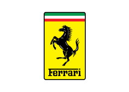
Yellow
Yellow generally indicates value. McDonald’s, Best Buy, and DHL are companies that have predominately yellow branding. It could also indicate youth or fun, like Ferrari and Snapchat.


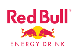
Red
This one’s tricky. It has a variety of meanings, but generally, companies that use red want to be seen as classic staples such as Coca-Cola, Target, and Netflix. It can also be used to portray power and emotions, like Tesla and Red Bull.

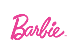
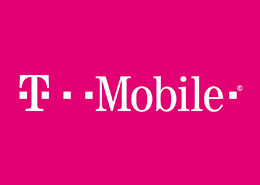
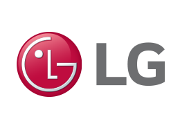
Pink
In the past, pink was used to convey products that would attract a female demographic, like the logos of Barbie and Victoria’s Secret. In recent years though, the color has experienced a lot of revitalization with millennial crowds and now is used for a lot of tech-friendly companies, such as Lyft, LG, and T-Mobile.


Blue
Blue has long been the favorite of technology companies and the wellness industry. Depending on the shade of blue, it can convey knowledge, stability, health, and trust. If you take one look at the apps on your phone, you’ll probably have instant confirmation of this. PayPal, AT&T, Waze, and Blue Cross all use blue.


Black
Black often conveys an edgier vibe. This may be used by companies that want to break free from the norm, or by rock bands. It’s also popularly used by a lot of fitness brands as well as by upscale restaurants. Some popular black logos are for Louis Vuitton, Apple, Adidas, and Daniel’s Broiler.


Orange
Orange may be the most versatile of all the colors. Originally used to target men, it can also be used by brands that want to portray creativity and fun. Brands that use orange are Home Depot, Harley Davidson, Fanta, Nickelodeon, and Blogger.


Certain color palettes have science that backs them up:
There are scientific studies that indicate that certain color combinations elicit physiological responses in the body. Other color patterns are also extremely easy to see. There’s a reason that most caution signs are black words on a dark yellow background. Initially, this was done because it’s the easiest color combination for us to read, but as people began to expect that color combination for street signs and caution messages, it took on a different meaning. You definitely don’t want to use this color combination unless it’s an urgent message or a matter of extreme importance.
Take some time to think about your brand colors and consider what image and purpose you want to portray for your business.